Landing page
With Doks you can easily configure a landing page for your documentation, fully managed from the Ghost admin UI with no coding required.
Use this landing page to display an eye-catching hero section, call to actions, testimonials, features, FAQs, and more.
Change the routes.yaml file
First, we need to change the default routes.yaml file.
Open the theme folder and locate a file named routes-landing-page.yaml, this file configures a landing page on the home page / and moves the main documentation to /docs.
Next, open Ghost admin and go to Settings then Labs, scroll to the "Routes" section and click on the "Upload routes file" button, then select and upload the routes-landing-page.yaml.
Creating the landing page sections
Each landing page section is represented by a normal post that has the internal tag #landing (internal tags must start with #).
The landing page sections will be displayed in a chronological order (oldest first). You can adjust the order by simply changing the "Publish date" on the post settings. You can display up to 30 sections maximum.
Following are the different section types and how to configure them:
Hero section
The hero section simply correspond to the first and oldest post that has the internal tag #landing.
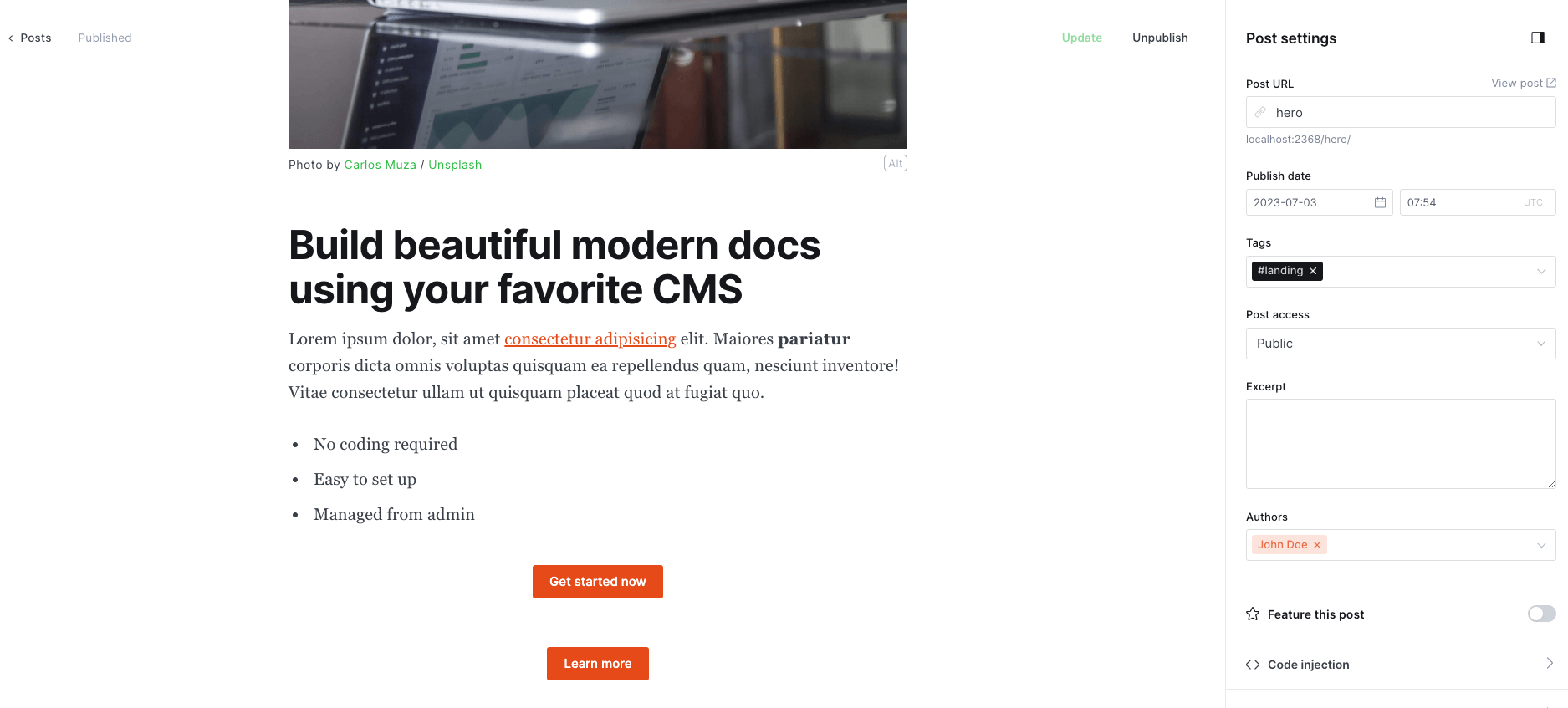
Open Ghost admin and start by creating a new post, give it a catchy title, then open the post settings and add the tag #landing.
Optionally, add some text to the post content, keep it short one paragraph maximum, you can add links and other text styles to it.
Optionally, you can add a short list after the previous paragraph, this list will be displayed as a horizontal checklist, use it to show high level features for example.
Optionally, you can add up to two buttons next, the first one will be the primary CTA with an accent color background, and the second one will be the secondary CTA with gray background. Make sure there is no empty space between the two buttons.
Optionally, you can also add a feature image.
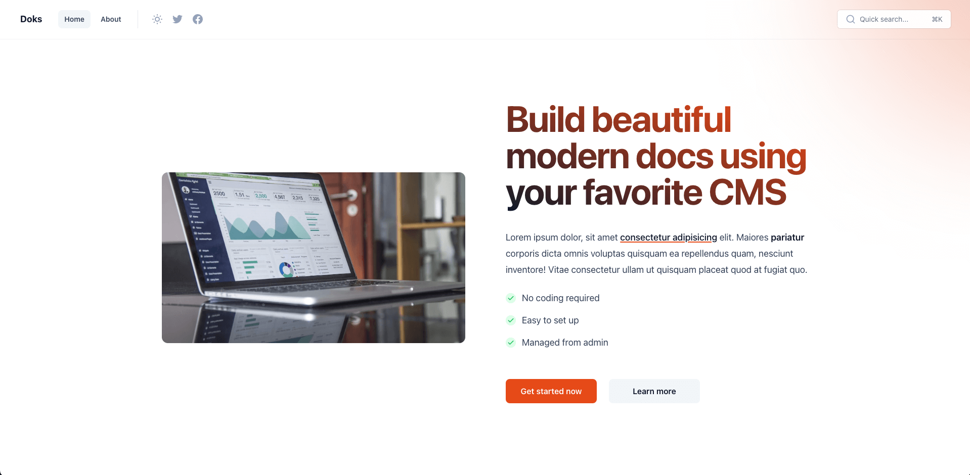
The final content should look like the following:
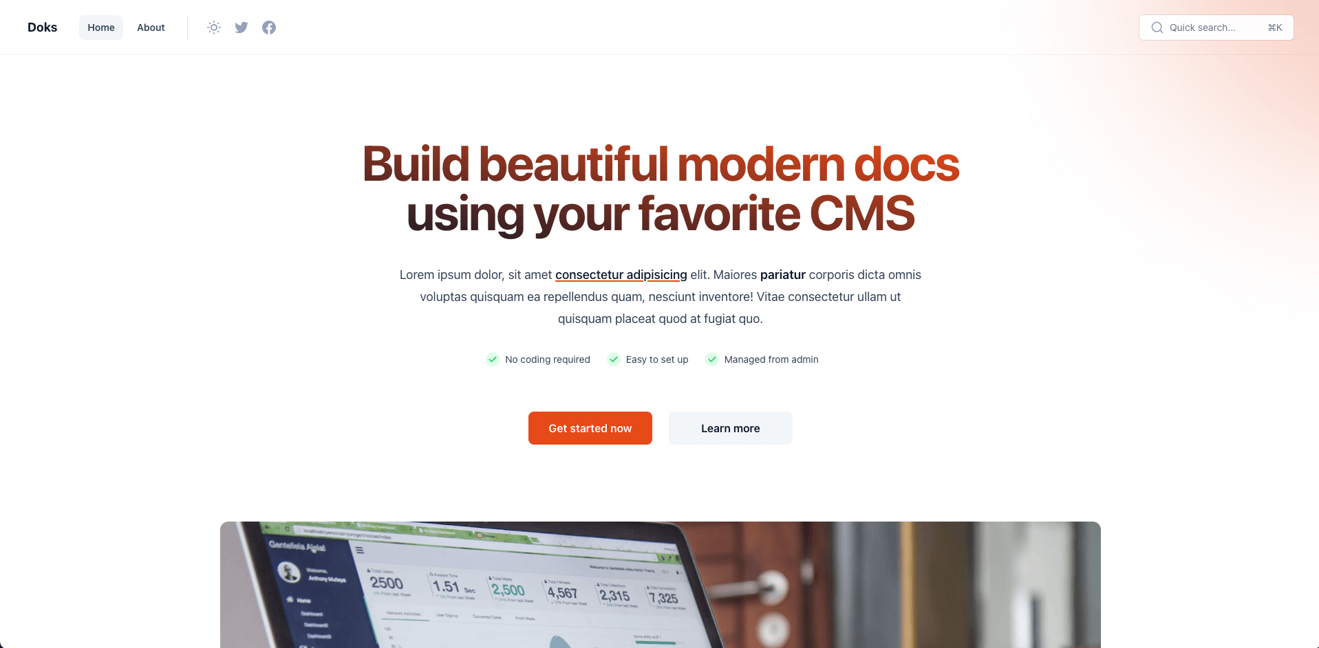
Finally, publish the post (make sure to publish on the web only, no emails). The result should look like this:
In case you need to adjust the title width (to break the title earlier for example, useful when you have a short title), go to Settings > Code injection, and paste the following code into the Site Header field (make sure to adjust the value 700px to your liking):
<style>
.home-template #main .landing-block-1 h1 {
max-width: 700px;
}
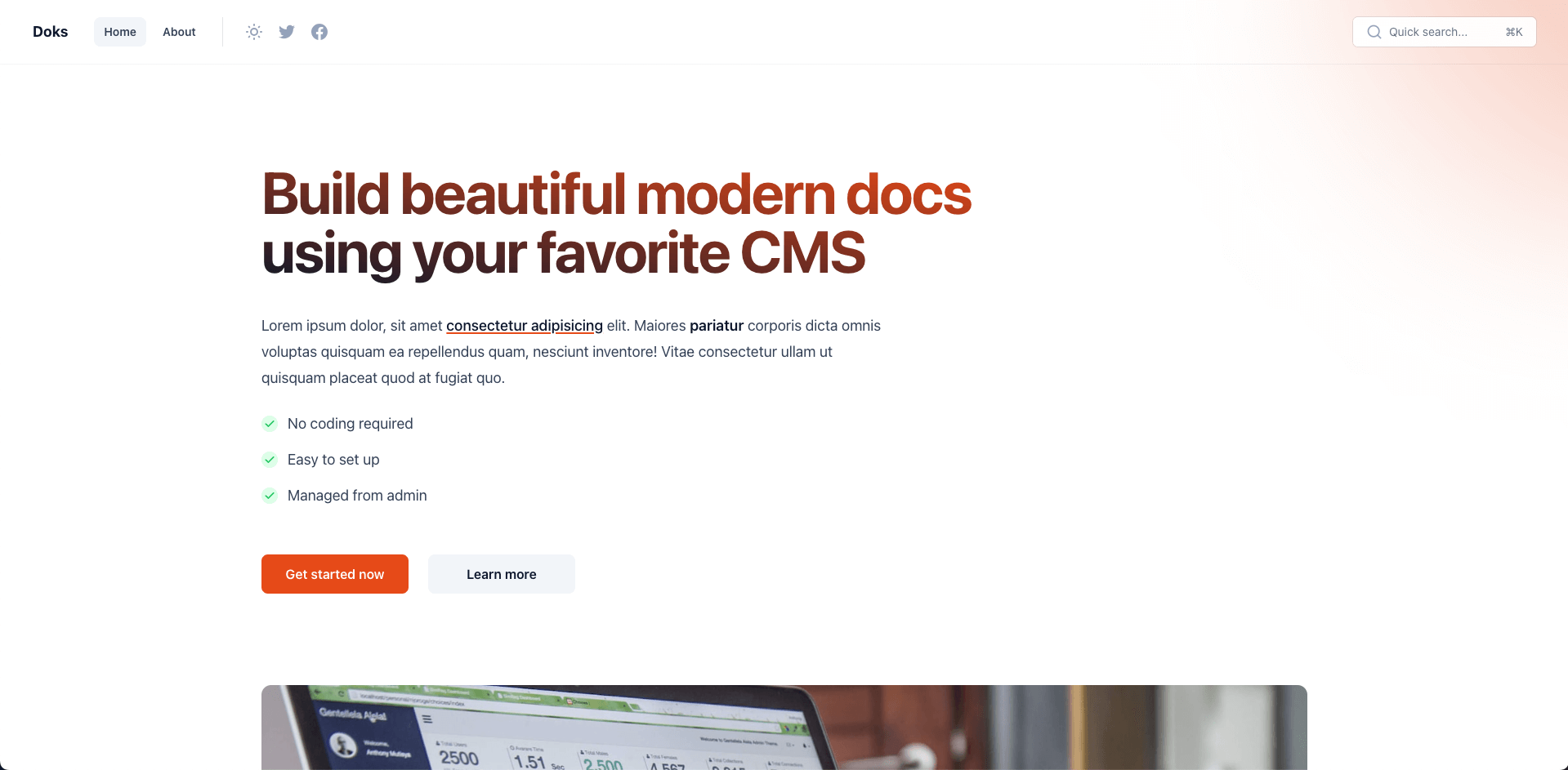
</style>By default, the section text is centered. You can add the internal tag #landing-txt-left to align it to the left (in this case the checklist will be displayed vertically):
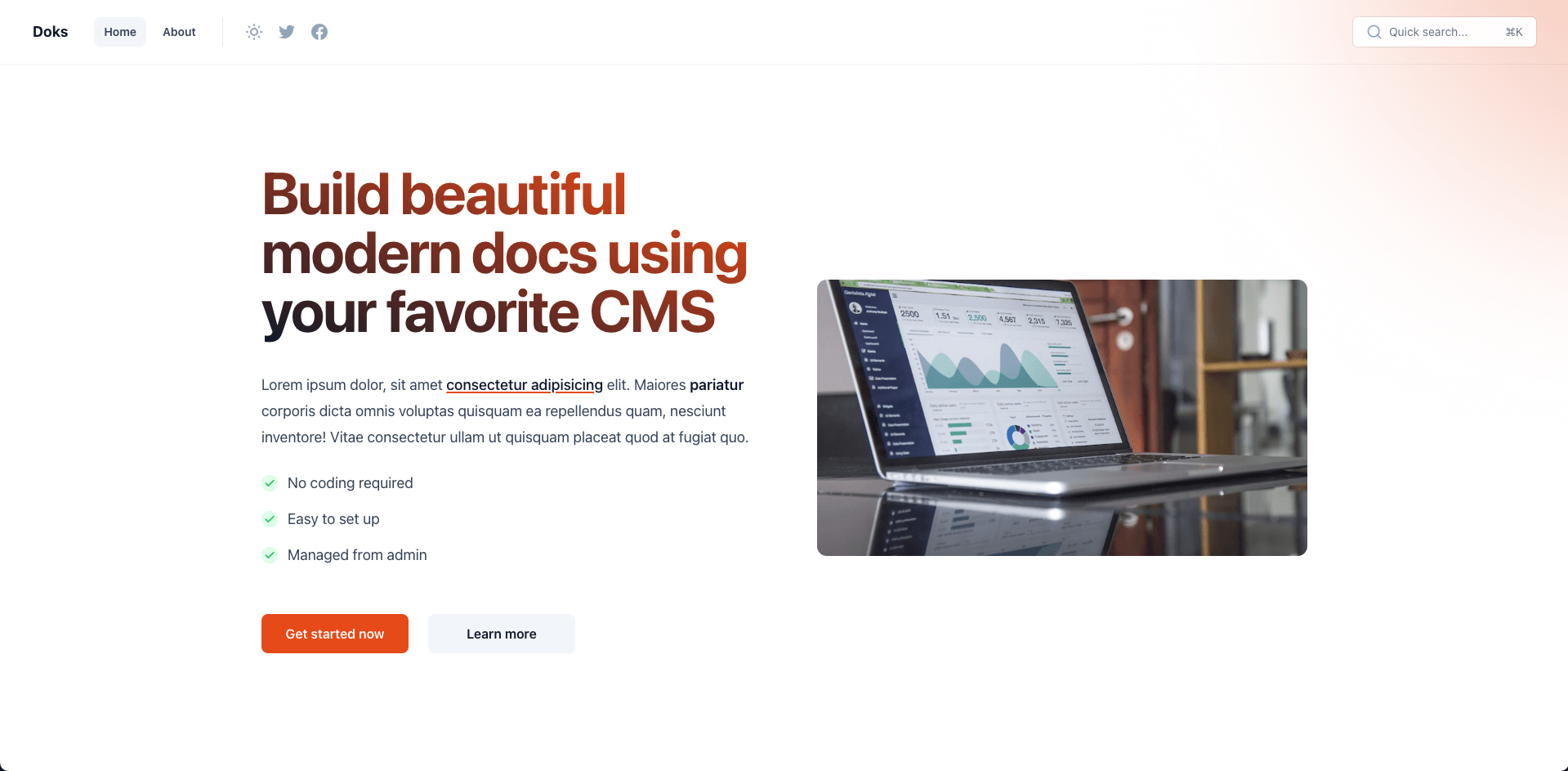
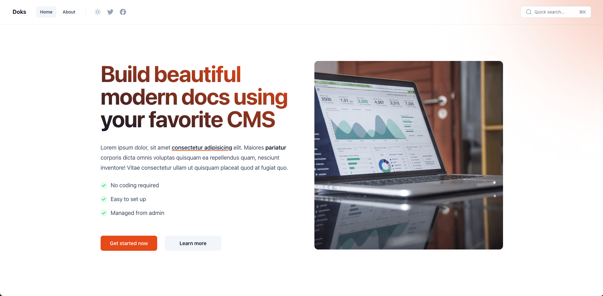
To push the feature image to the right side, add the internal tag #landing-img-right to the post:
To push the feature image to the left side, add the internal tag #landing-img-left to the post:
By default, the feature image is displayed using a 16:9 aspect ratio, depending on how much content you have, the image might look out of proportion. To change the feature image aspect ratio you can use one of the following internal tags:
- #landing-img-1-1 for square image
- #landing-img-3-4 for 3:4 aspect ratio (since v2.2.0)
- #landing-img-4-3 for 4:3 aspect ratio (since v2.2.0)
- #landing-img-4-5 for 4:5 aspect ratio
- #landing-img-5-4 for 5:4 aspect ratio
- #landing-img-9-16 for 9:16 aspect ratio
- #landing-img-16-9 for 16:9 aspect ratio (default)
Since v2.0.0, you can add an animation effect by adding the internal tag #landing-animation
Media sections
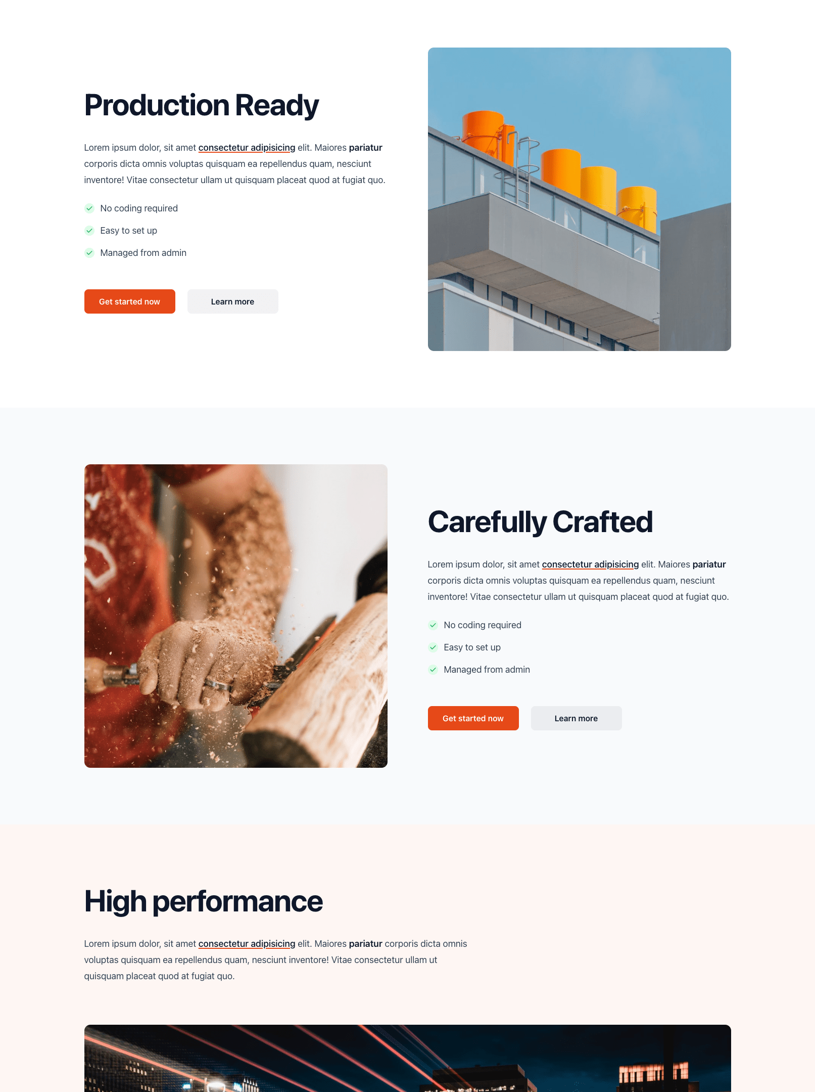
To create simple media sections (sections with title, short text, checklist, CTAs, and image), just repeat the same process we used previously to create the hero section, the same options are supported. The main difference is that the hero section's title has a larger font size and a gradient color and we use an h1 on the markup instead of h2.
To differentiate between the sections, you can play with image and text position (center, left, right), additionally you can also change the section's background from transparent to a light gray using the internal tag #landing-bg-alt or to a light accent color with the internal tag #landing-bg-accent.
In case you want to remove the vertical spacing in a section (to merge it with other sections for example), you can use the internal tag #landing-no-padding.
If you want to hide the section title use the internal tag #landing-no-title.
Testimonials section
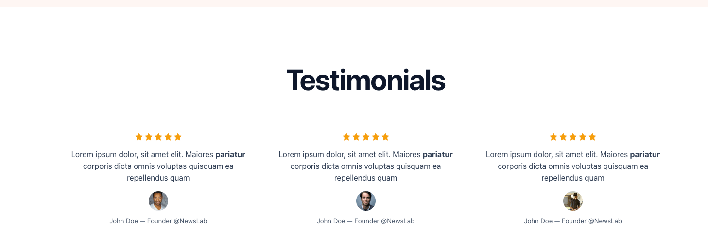
To add a testimonials section, create a new post, give it a title, then add the internal tags #landing and #landing-testimonials in the post settings.
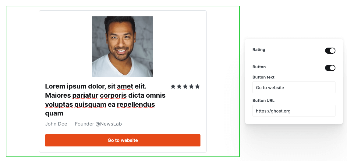
To create a testimonial, go to the post content and create a new Product card, you can find this card by clicking on the + icon on the left side of the editor or by typing /product in the editor, then select the Product option.
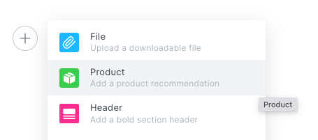
On the product card, fill in the title, this will be the testimonial main text.
Optionally, add a description, use it to show a person's name and job title.
Optionally, enabled rating, this will show the five stars.
Optionally, upload an image, this will be used as profile picture.
In case you want the testimonial to be clickable (have an external link), enable the button option on the card, fill in the text and the URL.
After publishing the post, you should see the following result:
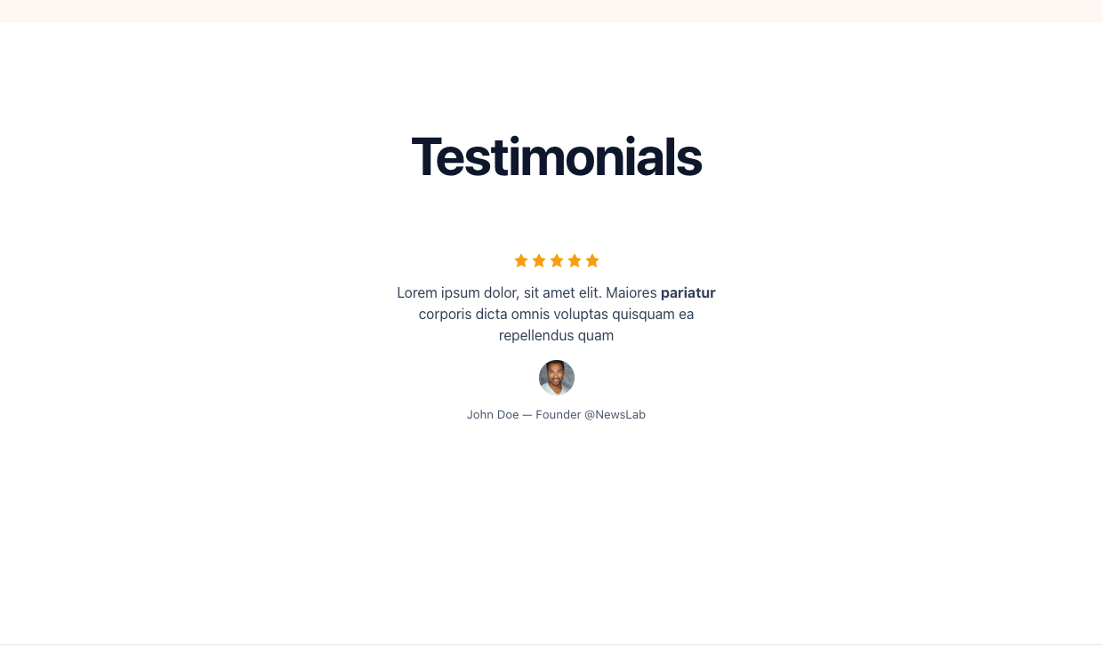
Repeat the process for each testimonial you have, make sure there is no empty space between the product cards. You can add as much as you want, but try to keep it less that 10 testimonials to avoid hurting the page load performance.
Optionally, you can add a short paragraph to the beginning of the content (before all product cards):
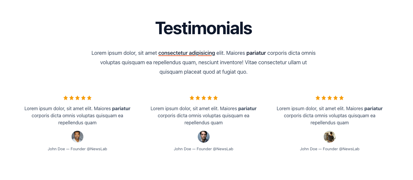
Text is always centered on this type of sections, we do not support any other type of alignments. Same thing for images.
Features section
To add a features section, create a new post, give it a title, then add the internal tags #landing and #landing-features in the post settings.
To create a feature block, go to the post content and create a new Product card. On the product card, fill in the title, this will be the feature name.
Optionally, add a short description.
Optionally, upload an image, square icon images works best (make sure the icon works for both light and dark theme).
In case you want the feature block to be clickable (have an external link), enable the button option on the card, fill in the text and the URL.
Repeat the process for each feature you have, make sure there is no empty space between the product cards.
Optionally, you can add a short paragraph to the beginning of the content (before all product cards).
After publishing the post, you should see the following result:
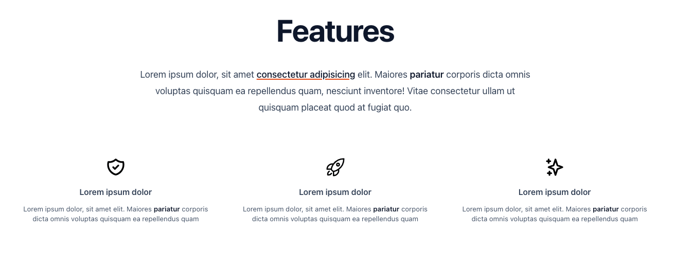
Text is always centered on this type of sections, we do not support any other type of alignments. Same thing for images.
FAQs section
To add a FAQs section, create a new post, give it a title, then add the internal tag #landing in the post settings.
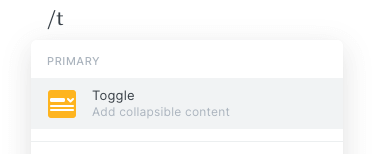
To create a Q&A block, go to the post content and create a new Toggle card. On the toggle card, fill in the title and the description.
Repeat the process for each Q&A you have, make sure there is no empty space between the toggle cards.
Optionally, you can add a short paragraph to the beginning of the content (before all toggle cards).
After publishing the post, you should see the following result:
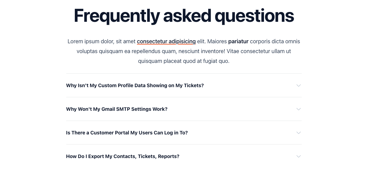
Text is always centered on this type of sections, we do not support any other type of alignments. Same thing for images.
Blog section
Add the internal tag #landing-blog to your landing post to show the latest 6 blog posts on your landing page.
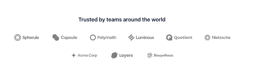
Brands section
To create a section with brand logos, add #landing-brands to your landing page post, add a product card to the content, upload the brand logo as the card image (a filter is applied to the image to make it work for both light and dark theme, a monochrome, SVG or transparent PNG is recommended), give the card a title for SEO, and optionally enable the card button to make it clickable. Repeat the process for all the brands, and make sure there is no empty space between the cards.
To replicate the same style as our demo, remove the post title with #landing-no-title, add a short paragraph, and reduce the padding with #landing-padding-md
Internal links between the sections
Each landing page section has an HTML id equal to the section's slug (post URL).
For example, the "Frequently asked questions" section has a slug and id equal to "frequently-asked-questions".
To link to that section from another section's CTA button, set the button's URL to #frequently-asked-questions (it should be #slug). If you change the section's slug later, remember to update the button's URL.
By default, we enabled smooth scrolling on this page, if you like to disable it inject the following code in Settings > Code injection > Site Header :
<style> :root { scroll-behavior: auto; } </style>Using the landing page template on multiple pages
You can use the landing page template on multiple pages, not just the homepage. To do so, follow these steps by editing your routes-landing-page.yaml file:
- Duplicate the
/collection for each additional landing page. - Update each duplicated collection:
- Change the URL and
permalink. - Change the
filterand make sure it’s unique by adding a second tag (e.g.#product,#service). The internal tag#landingmust be included in all collections. Update the/collection's filter as well to include a unique tag like#home. - Keep the same values for
template,order,rss, andlimit. - For all collections other than
/, add adatafield with the valuepage.PAGE-SLUG(e.g.page.product). Create a page in Ghost Admin for eachPAGE-SLUGused in thedatafield. This page provides the metadata (title, description, etc.).
- Upload the edited routes file to Settings > Labs > Routes.
If you’re self-hosting, you may need to restart the Ghost server. - Tag your posts properly according to the filters in your collections.
Here is an example of a 3 landing pages setup:
collections:
  /:
    permalink: /
    template: landing
    filter: "tags:hash-landing+tags:hash-home"
    order: "published_at asc"
    rss: false
    limit: "all"

  /product/:
    permalink: /product/
    template: landing
    filter: "tags:hash-landing+tags:hash-product"
    order: "published_at asc"
    rss: false
    limit: "all"
    data: page.product

  /service/:
    permalink: /service/
    template: landing
    filter: "tags:hash-landing+tags:hash-service"
    order: "published_at asc"
    rss: false
    limit: "all"
    data: page.service

  # ...
In this example, we’ve configured 3 landing pages:
- Homepage →
/ - Product page →
/product/ - Service page →
/service/
Each collection uses a unique second tag in the filter (in addition to #landing):
/uses#home/product/uses#product/service/uses#service
This means that in order to add a section to the /product/ page for example, we need to create a post tagged with both #landing and #product.
For /product/ and /service/, we added a data field pointing to page.product and page.service, respectively. This means that we need to create matching pages in Ghost Admin with slugs product and service. (If you see a "Too many redirects" error in the browser, check that the page slugs match the data field exactly.)
Options reference
Here you can find a quick reference to all supported options and tags:
- #landing — Make a post a landing page section
- #landing-txt-left — Align the section text to the left (useful when you want the text to the left but a full width image)
- #landing-img-right — Align the section image to the right (the text will be aligned to the left automatically)
- #landing-img-left — Align the section image to the left (the text will will be aligned to the right automatically)
- #landing-img-1-1 — for square section image (1:1 aspect ration)
- #landing-img-3-4 — section image with 3:4 aspect ratio (since v2.2.0)
- #landing-img-4-3 — section image with 4:3 aspect ratio (since v2.2.0)
- #landing-img-4-5 — section image with 4:5 aspect ratio
- #landing-img-5-4 — section image with 5:4 aspect ratio
- #landing-img-9-16 — section image with 9:16 aspect ratio
- #landing-img-16-9 — section image with 16:9 aspect ratio (default)
- #landing-bg-alt — change the section's background color to a light gray
- #landing-bg-accent — change the section's background color to a light accent color
- #landing-no-padding — remove the section's vertical padding
- #landing-no-padding-top — remove the section's top padding
- #landing-no-padding-bottom — remove the section's bottom padding
- #landing-padding-md — apply medium padding to the section
- #landing-padding-sm — apply smaller padding to the section
- #landing-no-title — Hide the section title
- #landing-testimonials — Create a testimonials section
- #landing-features — Create a features section
- #landing-animation — Enable animation on the current block (since v2.0.0)