Settings & Customization
Custom settings
You can customize the theme using the custom settings found in Settings > Design & branding:
Dark theme logo:
If your normal logo doesn’t look good on dark mode, you can upload a new one using this setting. This logo will only be displayed on dark mode. Please make sure both the light mode logo and the dark mode logo have the same size.
Dark theme accent color:
If your site’s accent color doesn’t look good on dark mode, you can adjust it using this setting. This new color will only be used on dark mode. Black (#000000) is a placeholder and is ignored.
Default color scheme:
Choose your website’s default color scheme: Light, Dark, or System.
Gray scale:
Choose different shades of gray and change the general tone of your website (cool, warm, neutral)
Body font:
By default the theme uses fonts available on your system. You can use this setting to choose a different body font from a predefined list of font families. Fonts are loaded from Google fonts, if you have privacy concerns please keep using the default system fonts.
Headings font:
You can use this setting to choose a different headings font from a predefined list of font families. Fonts are loaded from Google fonts, if you have privacy concerns please keep using the default system fonts.
Docs sidebar style:
Use this setting to change how the documentation sidebar looks: Neutral (Light gray), Transparent, or Dark.
Header style:
Use this setting to change how the site header looks: simple or with membership buttons.
Max navigation items:
The number of visible navigation items on large screens (1440px or larger), the rest is added to a dropdown. For medium screens (less than 1440px) the number of visible navigation items is always reduced to 5. This setting may also affect the number of visible social media links on the header which is sometimes reduced to 4 depending on the screen size.
If you have multiple navigation items with unusually long labels, leave the safer default setting.
Email signup title:
Change the signup title text that’s displayed on the site footer.
Email signup description:
Change the signup description text that’s displayed on the site footer (you can add <br> to the text to force a new line).
Footer description:
Custom footer description. Defaults to the global site description.
Footer copyright:
Custom footer copyright text. Defaults to site title and current year.
Logo aspect ratio:
Specify your logo’s dimension in the format width:height (e.g 152:58). This is used as enhancement to avoid content shifting on the navigation bar on page load.
Social media links
You can use internal tags to create links to any social media account.
Open Ghost Admin and go to Tags > Internal Tags, then click New tag.
The tag name should start with #social-, and the slug should start with hash-social-, followed by the platform name in lowercase (for example: #social-youtube, #social-telegram, #social-discord, …).
Supported platforms include X, Facebook, LinkedIn, Threads, Mastodon, TikTok, YouTube, Instagram, GitHub, Discord, Telegram, WhatsApp, Dribbble, and Reddit.
Next, expand the Meta data section and add your social profile URL to the Canonical URL field.
If the platform is not one of the supported platforms listed above, upload an SVG icon with a transparent background as the tag image, then set the platform name in Meta data > Meta title.
Finally, add the tag to any public page or post to activate it (for example, a Contact or About page).
Repeat the process for all your social media links.
The links will be displayed alphabetically based on the tag name. To control the display order, add a number to the tag name (not the slug), for example: #social-01-discord. Social accounts configured in Settings > General settings > Social accounts are always displayed before the ones configured using tags.
Menu dropdowns
Since version 3.0.0 you can create multiple menu dropdowns for your primary navigation:
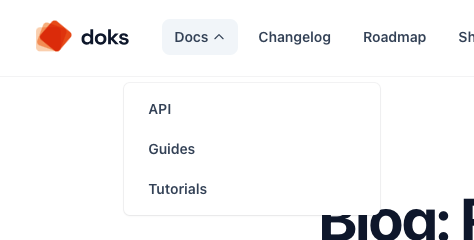
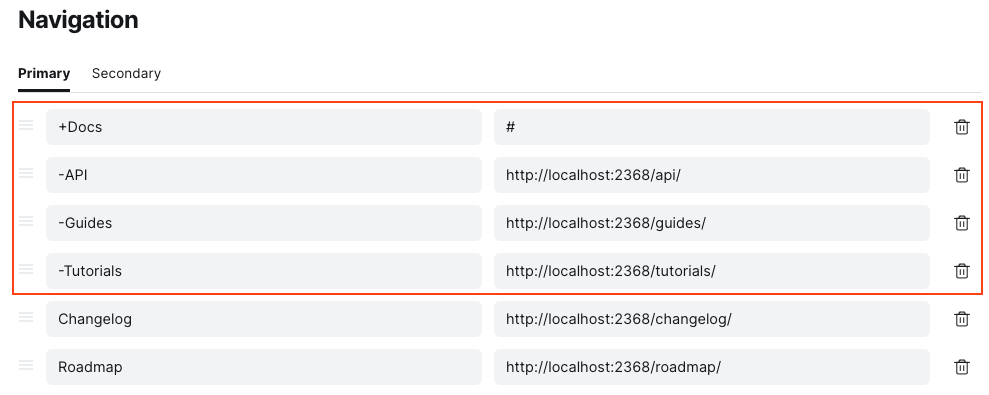
To create a dropdown, add + to the beginning of a navigation item (the URL for this item is ignored), then follow it with items that start with - (make sure there is no space before the + and - characters).
You can create multiple dropdowns, each dropdown can include up to 10 inner items.
Footer columns
Similar to the menu dropdowns, you can create footer columns using secondary navigation items.
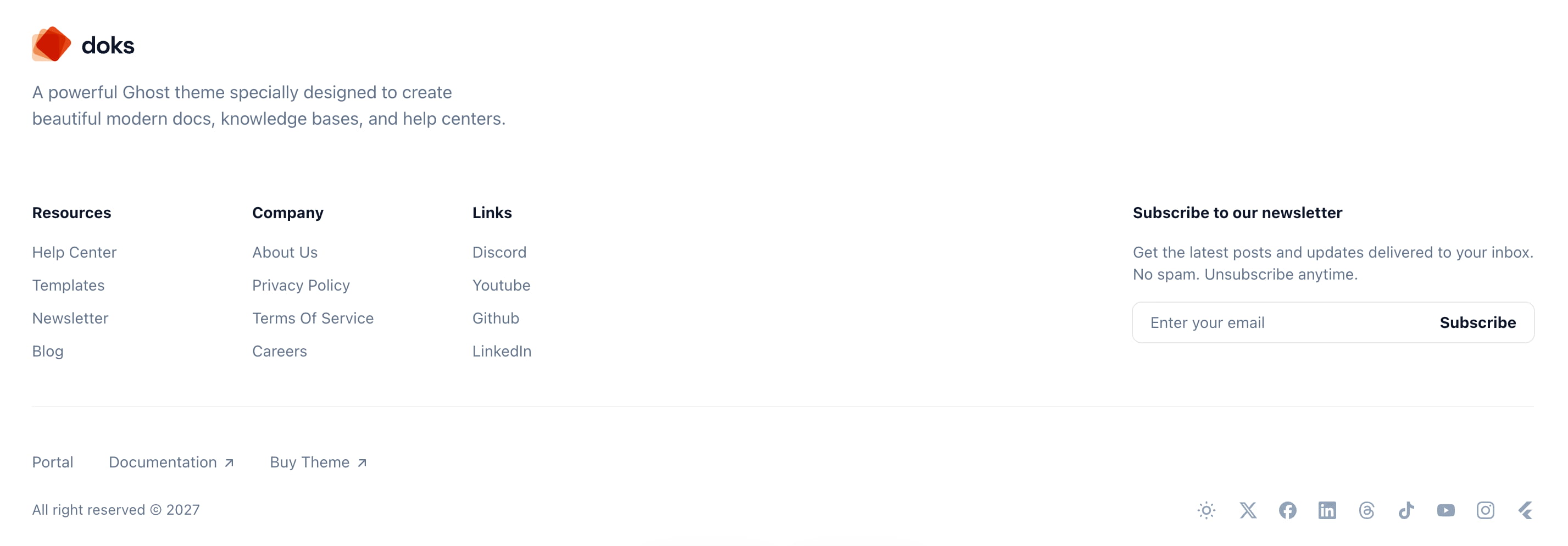
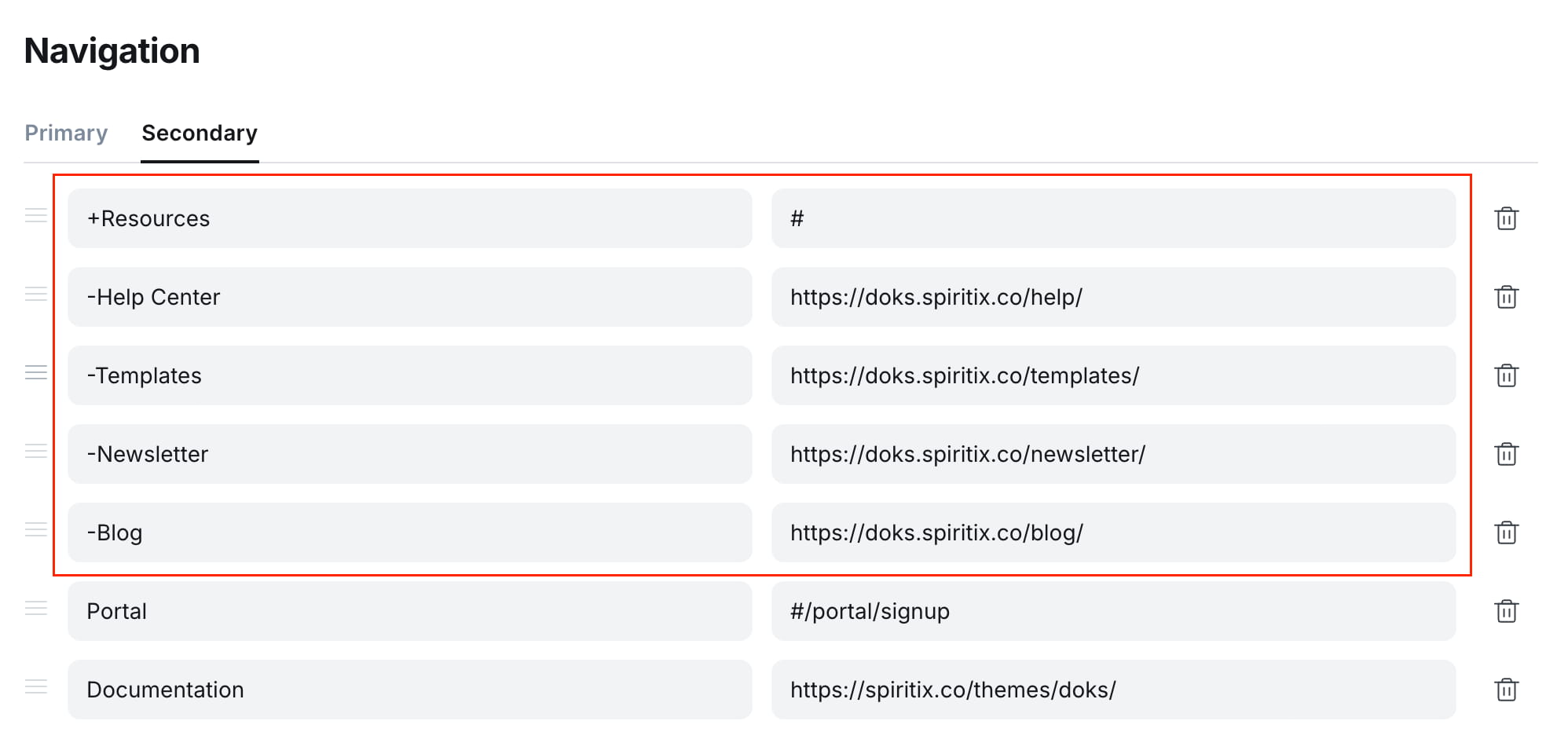
To create a column, add + at the beginning of a secondary navigation item. This item will be used as the column title, and its URL will be ignored.
Then, add items that start with - under it to create links within that column.
Make sure there is no space before the + or - characters.
Items without a prefix will be displayed normally, similar to the previous version.
Translations
The theme comes with English and French translations. The translation files are stored in the locales folder inside the theme ZIP file.
If you need to translate the theme into a different language you have to create the corresponding translation file. Start by duplicating the default file locales/en.json, then rename it with a valid language code (e.g. locales/es.json for Spanish). Then go through each line and translate the right-hand sentences to the new language.
Exclude from search
You can exclude some posts, tags, or authors from search results by injecting the following code into Settings > Code injection > Site footer and replacing the example slugs with your own.
<script>
  window.Spiritix.excludeFromSearch = {
    posts: [
      "example-post-slug-1",
      "example-post-slug-2",
    ],
    tags: [
      "example-tag-slug-1",
    ],
    authors: [
      "example-author-slug-1",
    ],
  };
</script>
Theme development
If you want to extend the theme even further, the theme comes with a developer-friendly setup based on multiple Gulp tasks.
First, you’ll need Node installed globally. Then, follow the official guide on how to install Ghost locally.
After Ghost is installed, make sure to copy the theme folder to <ghost>/content/themes, you can then start using the following commands:
Install dependencies
From the theme’s root directory, run the following command to install dependencies:
npm install
Start development server
The following command starts a development server with Livereload enabled
npm run dev
Compile CSS
We use PostCSS and TailwindCSS (v3) to manage our CSS. All CSS files in /assets/css/ and imported in /assets/css/main.css, will be compiled to /assets/built/css/main.min.css automatically, in addition to any TailwindCSS utility class used in .hbs or .js files.
npm run css
Compile Javascript
Javascript files in /assets/js/ will be compiled to /assets/built/js/main.min.js automatically.
npm run js
Build all assets
To compile all assets, run the following command:
npm run build
Test theme
To test the theme compatibility using Gscan, run the following command:
npm run test
Create ZIP file
The zip Gulp task packages the theme files into dist/<theme-name>.zip, which you can then upload to your site.
npm run zip